Everything works.
Nothing shows.
Audio, video, lighting, and control for houses across Greater Milwaukee and Madison. One room or the whole house, built on Control4, wired by us, hidden in the walls.
Book the consultation- Waukesha
- Elm Grove
- Delafield
- Hartland
- Oconomowoc
- Merton
- Sussex
- Menomonee Falls
- Wauwatosa
- Milwaukee
- Mequon
- Madison
The whole house,from the kitchen counter.
Lighting, audio, climate, locks, and cameras answering to one interface your family already knows how to use. Built on Control4, programmed by the people who installed it.
Explore smart home automation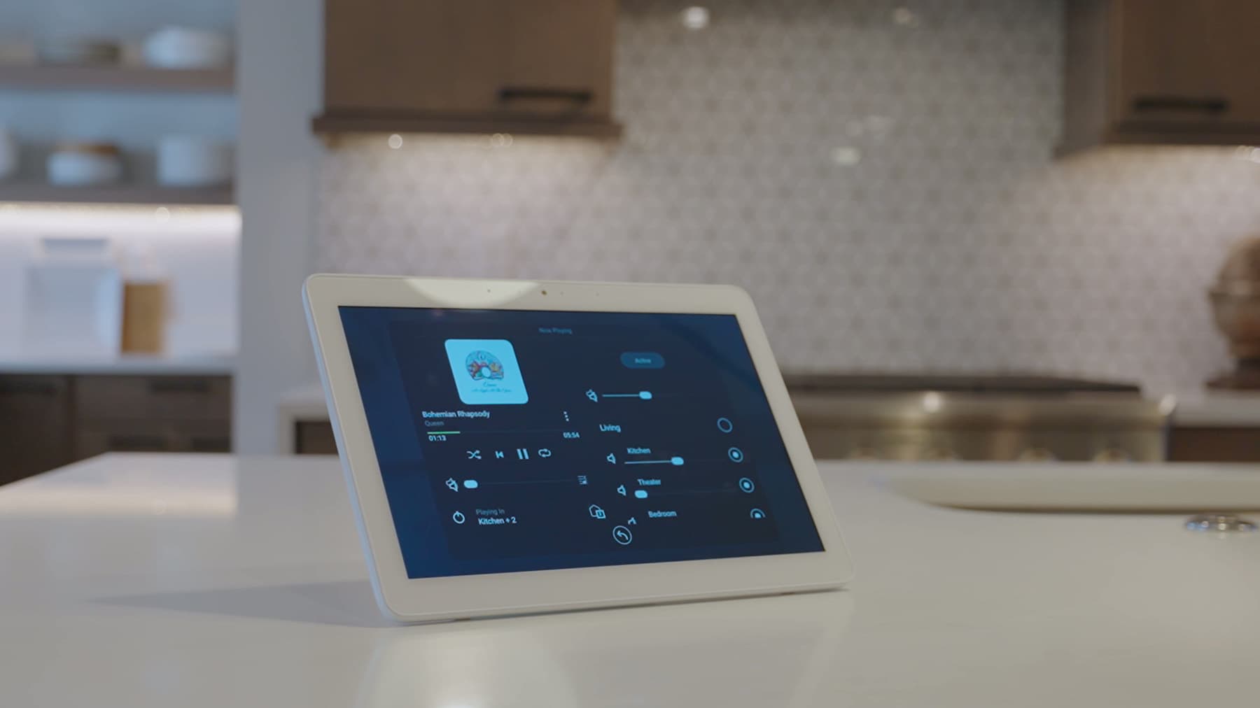
A real cinema,in your basement.
Room acoustics, sightlines, seating risers, and calibration. We design the room around the screen, not the screen around whatever wall was left over.
Explore custom home theater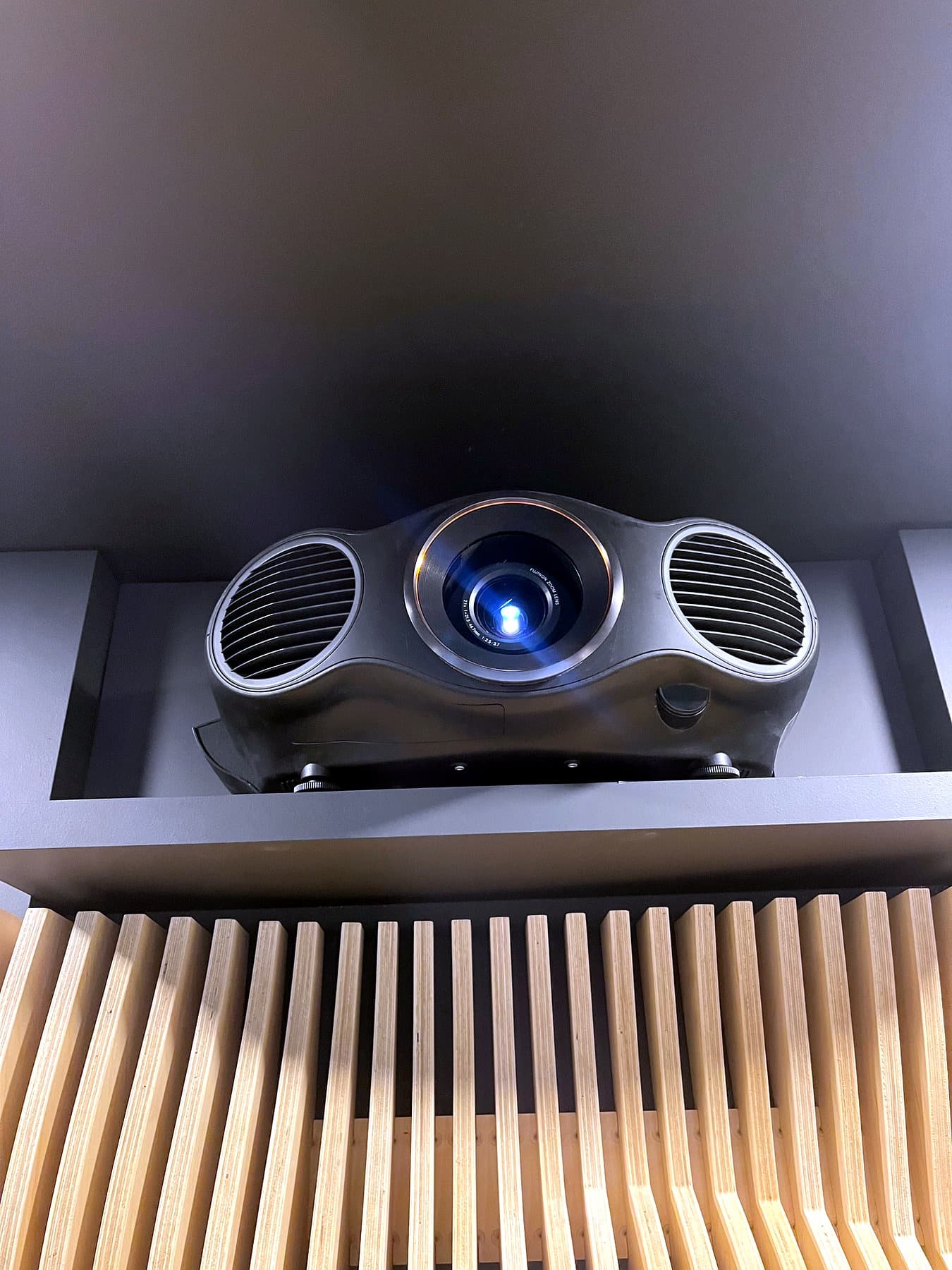
Sound in every room.Sources in one closet.
Multi-room audio, ultra high definition video distribution, large format displays, and Micro LED walls. Every source in the rack, no boxes under any television.
Explore distributed audio and video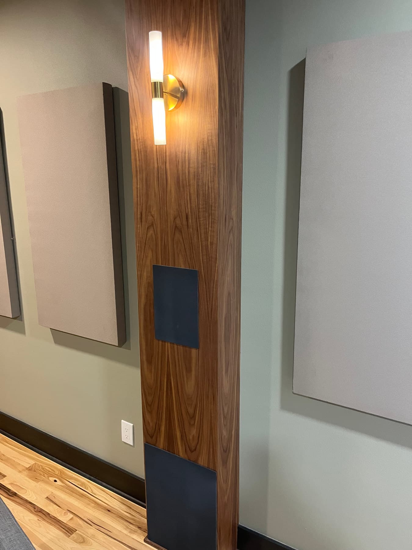
Wi-Fi that worksin every room.
Structured cabling, enterprise access points, and a switch that can carry the whole house. Most of what people call a smart home problem is a network problem.
Explore network and data infrastructure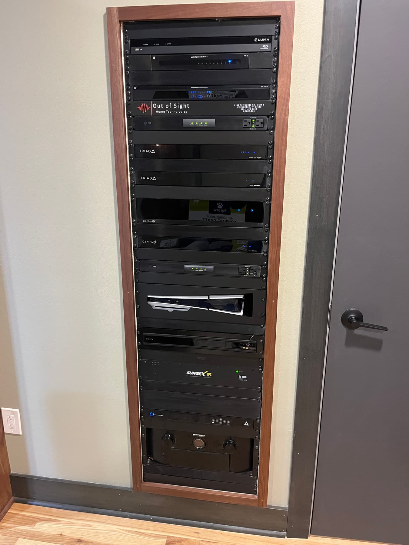
Try a smart-home scene
One touch changes
how the room feels.
Use the buttons below the photo to preview the lighting and screen changes. The audio label shows the matching sound setting; this demo does not play audio.
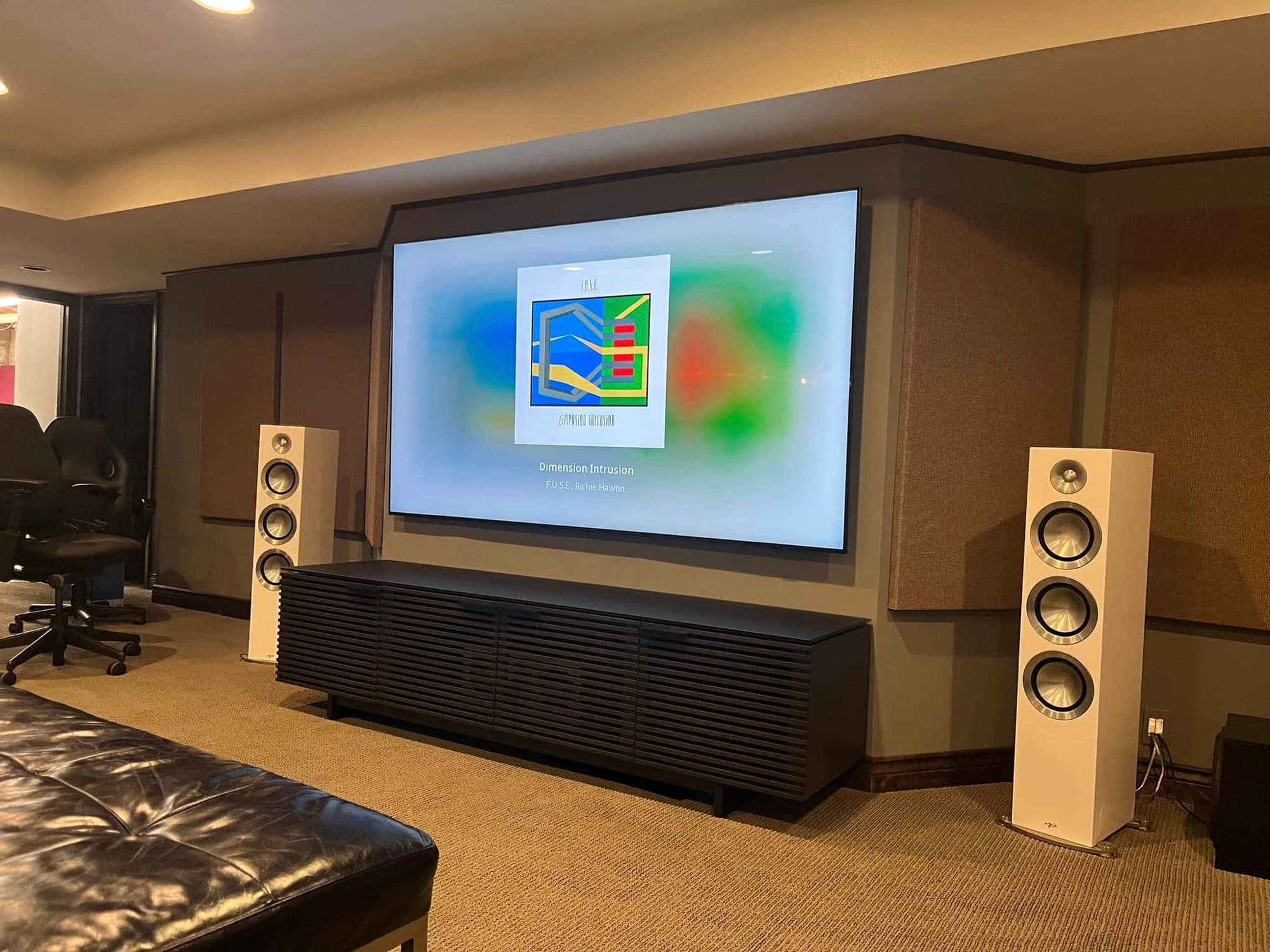
Movie dims the lights to 12%, turns the screen on, and selects surround sound.
- Screen
- On
- Audio
- Surround
Visual simulation using a real OOSHT project photo. These lighting levels and scenes are examples; we design yours around your home.
Before you build
Good questions.
Better decisions.
Know what to ask about the room, the system, and what comes after installation.
- System planning
What to Prepare for a Smart Home Consultation
A room list, equipment photos, and the right questions help turn a smart home idea into a clear installation scope.
- Control4
How Much Does a Control4 System Cost?
What changes a Control4 proposal: rooms, wiring, equipment, programming, and ongoing services.
- Home theater
How Much Does Home Theater Installation Cost?
A practical way to compare the room, equipment, wiring, acoustics, and calibration in a theater proposal.
Everything we install,and where.
- Smart Home AutomationOne system instead of nine appsRead more
- Custom Home TheaterA real cinema, in your basementRead more
- Distributed Audio and VideoSound in every room, sources in one closetRead more
- Network and Data InfrastructureWi-Fi that works in every roomRead more
- Lighting ControlScenes, not switchesRead more
- Motorized ShadesLight on a scheduleRead more
- Surveillance and SecurityCameras you can actually readRead more
- Commercial AV and SurveillanceConference rooms, signage, cameras, Wi-FiRead more
- Finished projectsPhotos of installed work. The houses are never named.See projects
- Where we workGreater Milwaukee and Madison, from the showroom in Waukesha.See areas
Built for the houseyou already pictured.
We walk the house, listen to what you actually want, and leave you with a plan and a number.
Book the consultation